Helping an agency attract clients by merging a design portfolio with an e-commerce knowledge center
Timeframe:
4 weeks - 2022
My Role:
UX/UI Designer
Featured Skills:
Research
Concept UX design
Visual UI design
Usability testing
Teammates:
Stephanie Larson
Garrett Hoffmann
GeeYun Chae
Client Website:
tempusgroup.com

The Client:
We worked directly with Jared Knapp from Tempus Creative, a design agency focused on helping businesses achieve their design goals. They offer creative experiences, marketing strategies and design services to amplify client brands and drive growth.
Project Status:
This agency had attracted many of their client work through networking and wanted to redesign their existing website to start attracting a broader audience. I and my teammates were brought on to help with the website redesign.
Design Challenge:
Create a desktop website that showcases both the design services Tempus Creative can offer and branded e-books that can help clients learn about design on their own. A combination of a design portfolio and a self learning knowledge center to attract clients of varying design goals and budgets.
Outcomes & Learnings:
We delivered a competitive anlaysis along with two iterations of designs with usability test data. The client was happy with the work and was excited to use it as a starting point for their redesign endeavors. I gained experince in working collaboratively as a team and learned more about creating designs that meet both customer and business needs.

"Amelia assisted my company with a web overhaul combining both an existing sales funnel with common practice e-commerce. Ultimately providing a balanced solution that allows our customers to choose between our product and service offerings. I can confidently attest to her ability to thrive in unknown territory. I witnessed her adapt to the unique request with professional execution."
-Jared Knapp
Founder of Tempus Creative

Listening to the Client
Prior to meeting with the client (Jared) I tried to learn as much in advance about the company, their values and who they catered to. During our kickoff call it was great to hear Jared articulate what his goals were for the project and any constraints he knew of.
What I Did
I sent out a scheduling poll to my teammates since we were working across three different time zones. I reached out to Jared about setting up a project kickoff call and lead the meeting by asking the questions that myself and my teammates had prepared.
Merging a Portfolio and E-commerce Knowledge Center
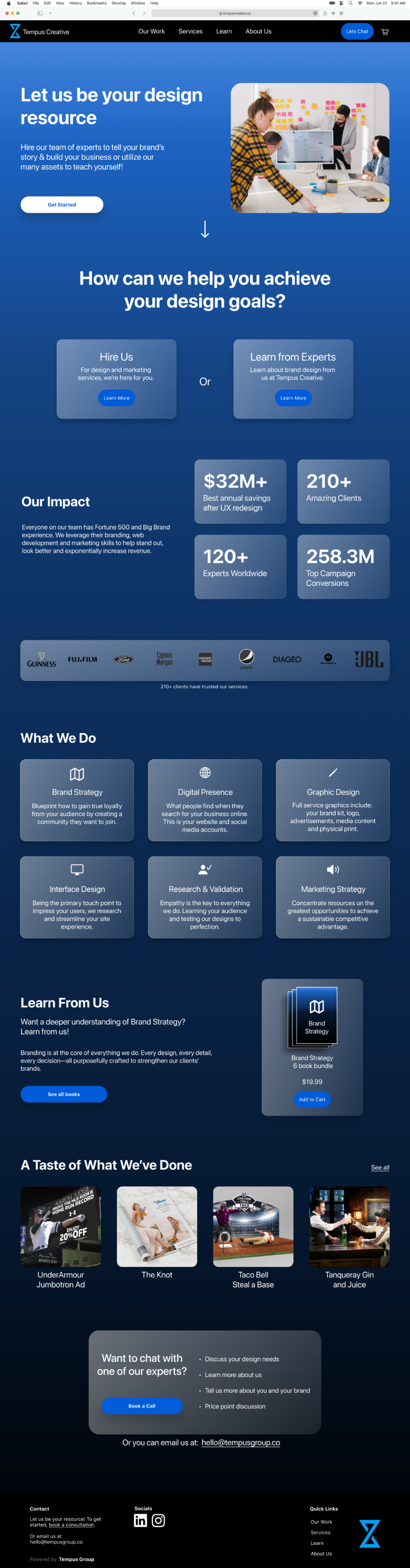
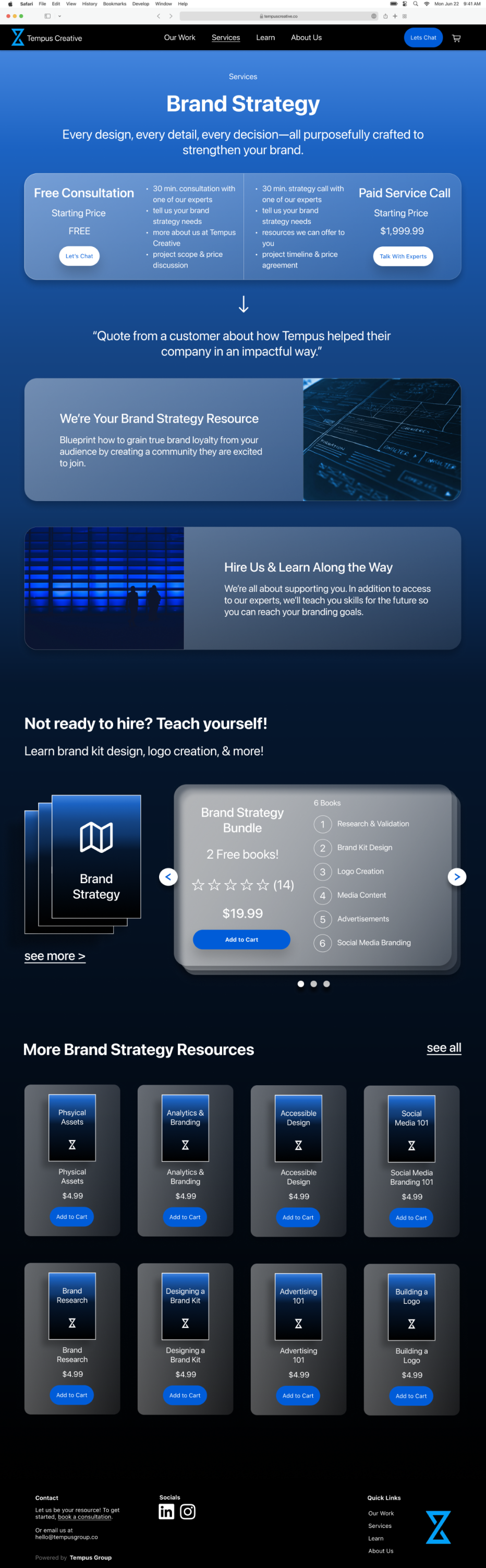
We learned that Jared wanted to redesign the Tempus Creative website to attract more clients. He wanted to showcase past design work the agency had done. Along with this he also wanted to sell e-books about design and marketing on this website. His goal was to appeal to clients who may not be interested in design services and would prefer to learn how to do things on their own.
Reviewing Other Successful Websites
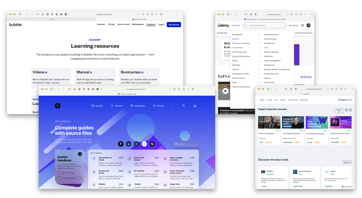
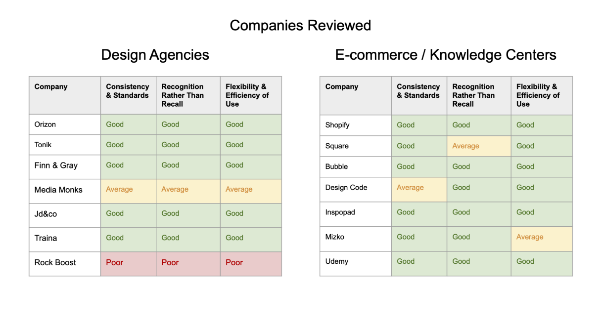
As a team we performed a competitive analysis to see what has been successful and what to avoid for both design agency/portfolio and e-commerce websites. We assessed 16 websites in total and scored each site based on 3 of Jakob Neilsen’s usability heuristics.
What I Did and Learned
I assessed 5 websites on my own. I specifically tried to find websites that sold digital products and presented themselves more as an online resource center vs websites that represented a brick and mortar store.
Across all the websites I learned how important it is to have a clear and easy navigation. Also, that social proof is key to building trust, especially when buying a digital product like an e-book.
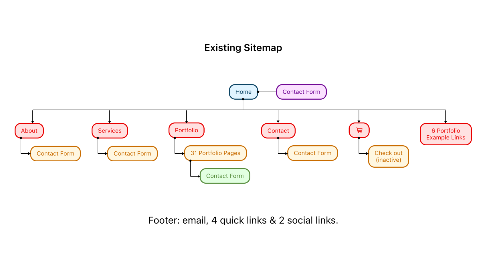
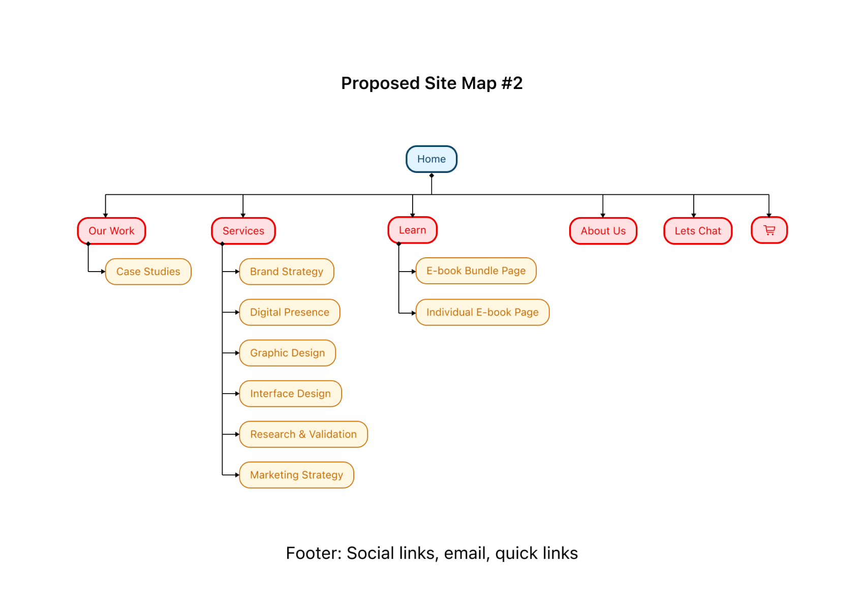
Redesigning the Information Architecture
We mapped out the existing site structure just to assess the current condition. We initially proposed to divide the website into three sections: portfolio, services and resources. With continued iterations we discovered that having only three sections was too broad. To alleviate the mental load, we expanded to show more options upfront for people to choose from.

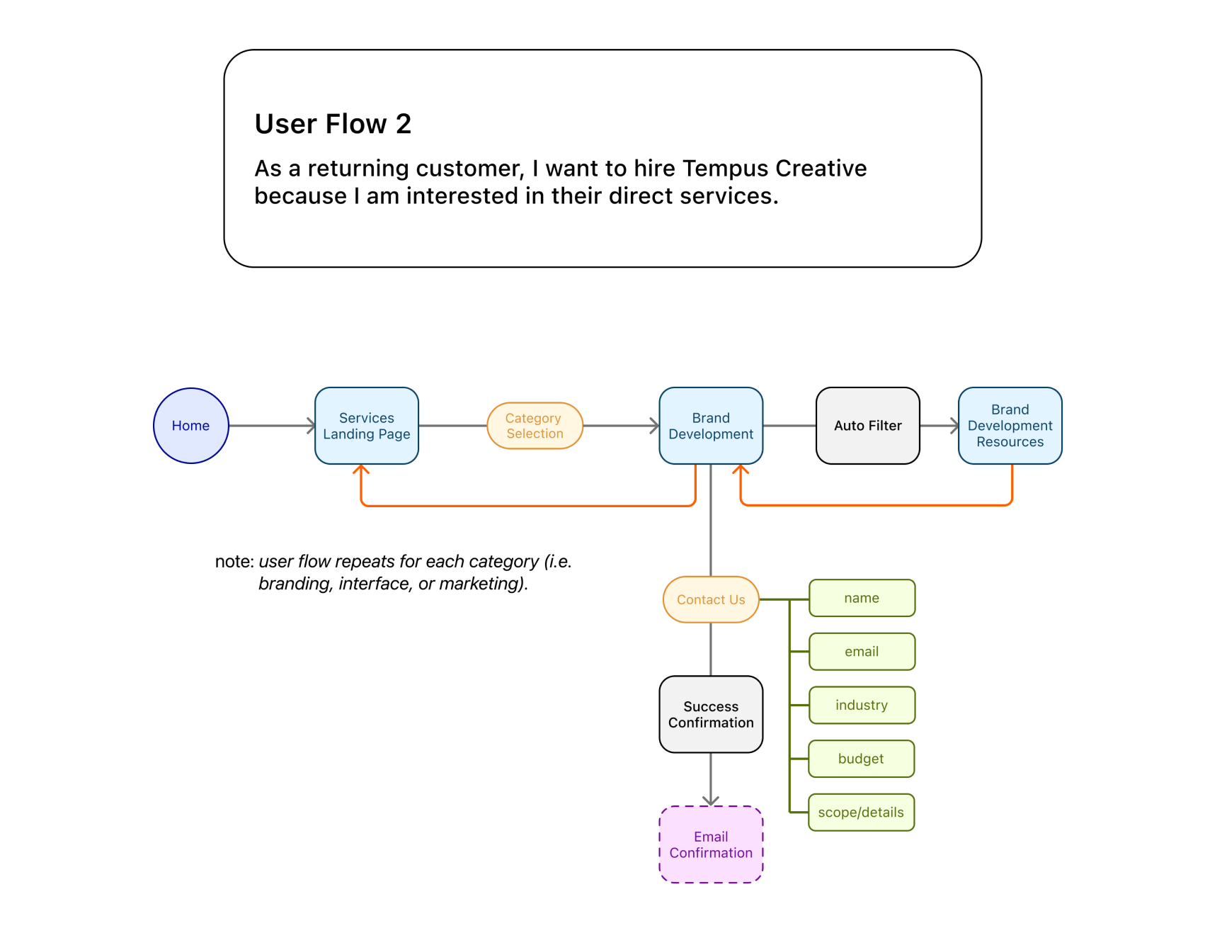
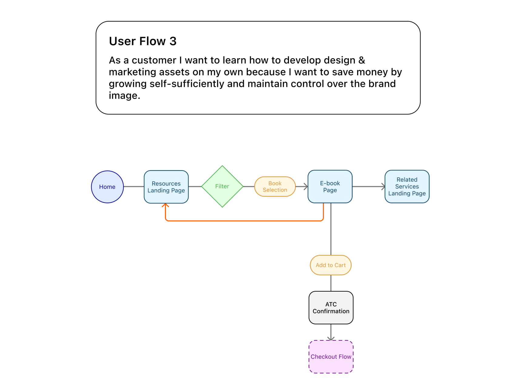
Thinking Through User Flows
With our site map established we initially built out 4 user flows. These eventually became 3 user flows since we realized that the experience of searching for e-books was the same for new customers as it was for returning customers.
What I Did and Learned
I specifically worked on user flow #1, the experience a new prospective customer would have as they looked at past work done by Tempus Creative. These userflows helped me think about who would be visiting this agency website and what their goals were. It forced myself and my teammates to define and prioritize the main call to action we wanted highlight.


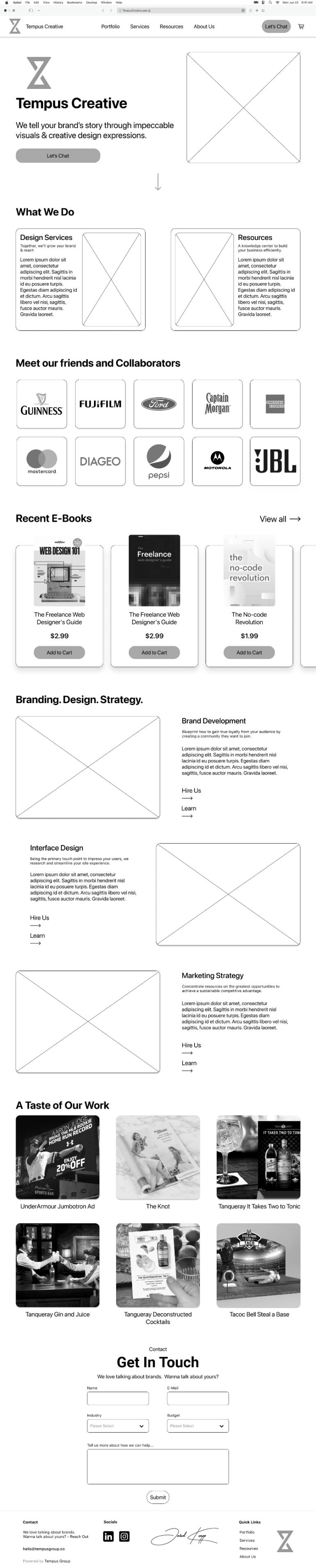
Turning Sketches Into Wireframes
The user flows helped us know which screens would need to be designed. I sketched and did some wireframe options for the portfolio page. We worked together to form a wireframe prototype to test with others. I specifically helped with the e-book page and overall prototype animations.

Seeing Reactions From People
As a group we conducted 5 moderated usability tests. 3 people with UX backgrounds and 2 people who were business owners who have previously searched for design services. We were eager to learn about the success rate of our information architecture, initial impressions of the Tempus Creative brand, and thoughts on the e-book/learning resource section. We timed how long it took for people to perform each task to establish a benchmark to help validate future design iterations.
What I Did and Learned
I conducted 2 of the usability tests. From all the testing data I learned that:
Presenting Our Work
We presented all our progress work to the client.
Our slide deck included:
What I Did and Learned
I specifically formatted and presented slides explaining our usability testing methods and findings. I also lead the wrap up portion of the meeting. I confirmed our next call with the client, next steps and any lingering questions.
Iterating on Designs Based on Feedback
Jared was happy with the progress we had done so far and was excited to see our next design iterations. Jared shared new ideas he had for his website along with more detailed information about his e-book sale plans.
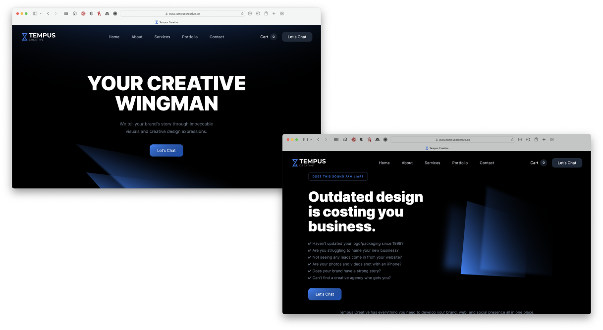
Jared wanted the attention to be less about the Tempus Creative brand and more about what customers need. We changed the wording on the home page and prioritized the hire vs learn actions.
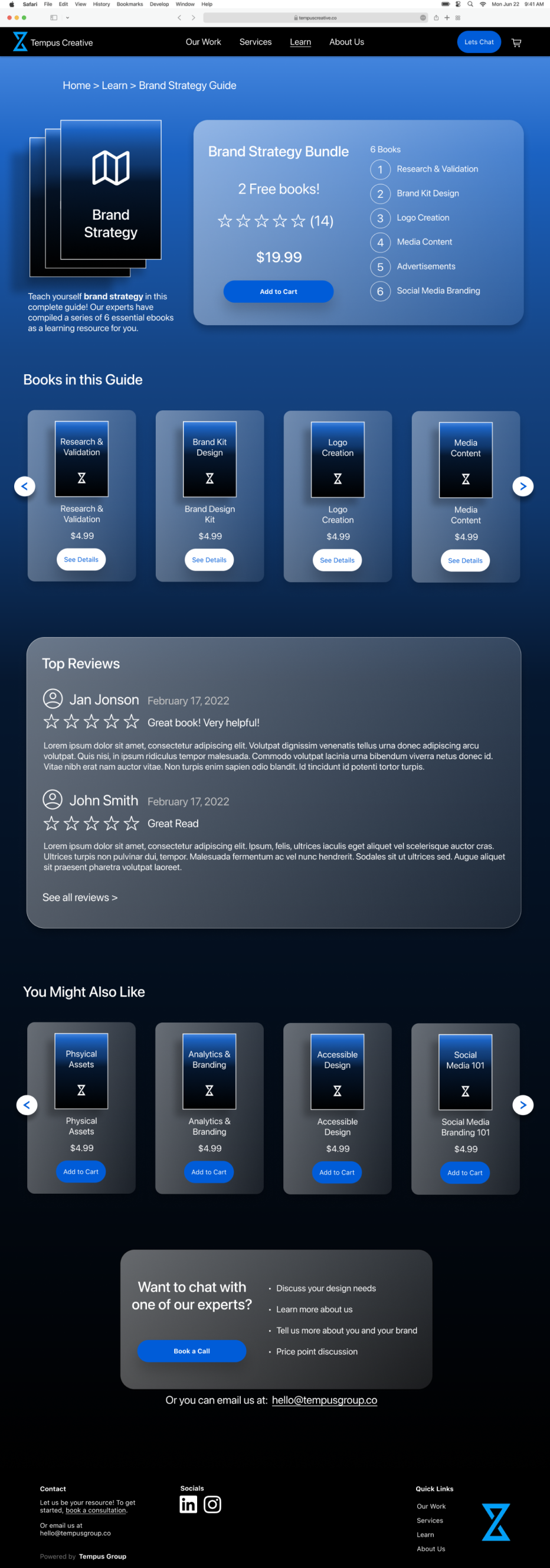
It was mentioned that e-books could also be sold in bundles.
We made cards to showcase the e-book bundles.
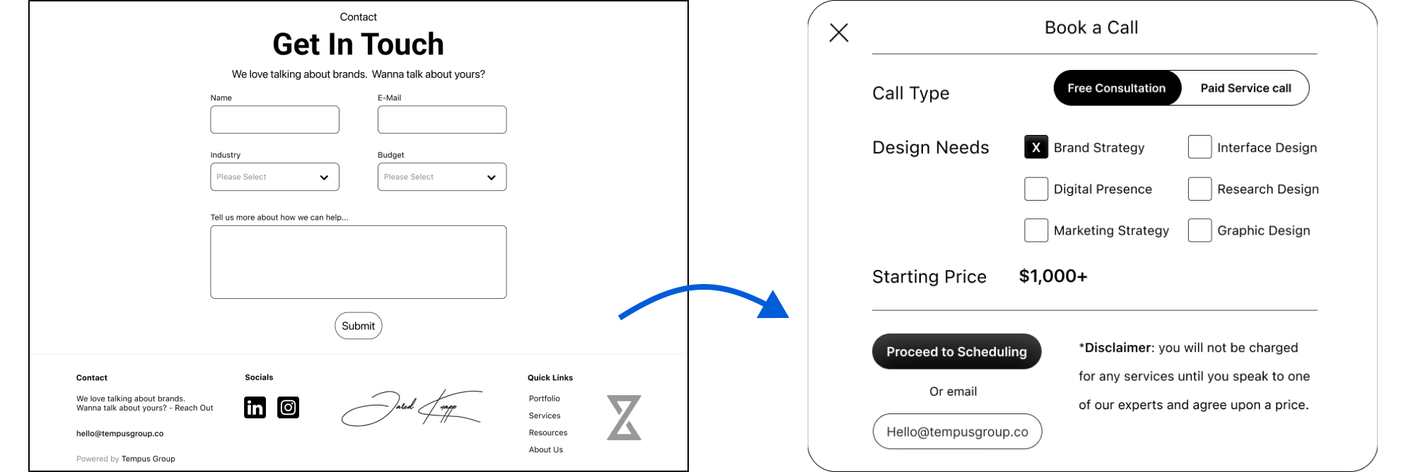
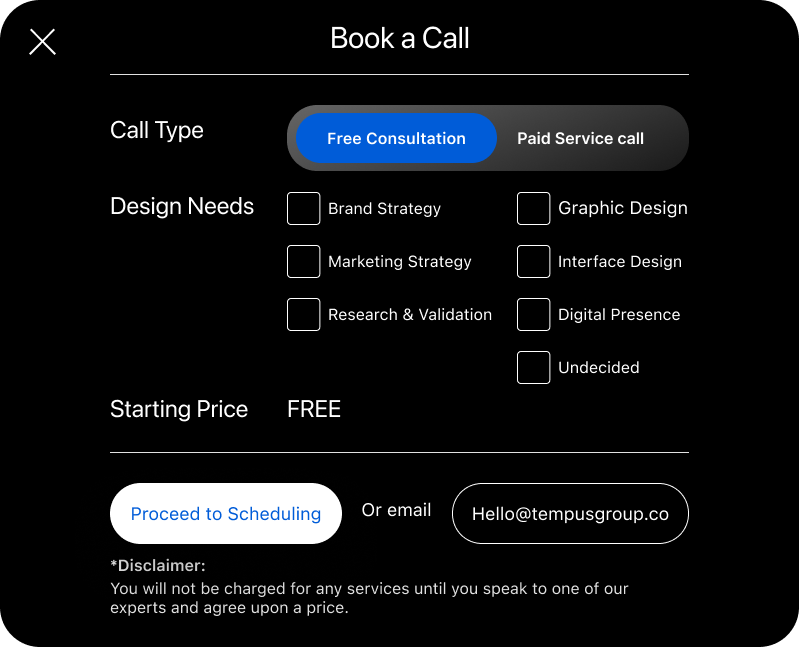
Jared want to avoid the lengthy contact form. He wanted a quicker way for people to contact Tempus Creative about hiring needs. We replaced the contact form with a “book-a-call” modal with less typing required to connect with Tempus Creative.
Creating Consistency With a Style Guide
We sketched out new ideas and started forming wireframes when we realized that we needed a style guide to help standardize things. We were ultimately working towards creating high fidelity designs so establishing these rules and styles was super helpful in bringing our designs to the next level.


What I Did:
I sketched out ideas for the home, services and e-book pages. I helped establish consistent typography styles and UI element designs. I helped create the high fidelity versions of the home page, cart pop up, and “book a call” modal. To bring everything together I animated most of the screens together and prototyped specific hover states for buttons and action cards.

We walked our client through the high fidelity designs, and he was inspired by our work.
Throughout this process I’ve learned the importance of sketching/visualizing an idea out. Especially when working with clients, people are so visual and like to see ideas sketched out.
Working with a design team was so much fun. Through collaborating and effective project planning we were able to cover a large scope of work in just 4 weeks.
This project gave me practice in thinking about how designs can ultimately help people make a profit. Creating experiences that help both customers and businesses with their intended goals.


Currently looking for new opportunities with a design team.
Reach out if you:
